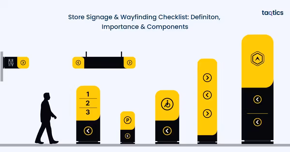
Store Signage & Wayfinding Checklist: Definiton, Importance & Components
Store signage and wayfinding checklist include everything that helps retailer manage essential elements of retail design to guide customers through a store, helping them locate products, understand layouts, and navigate spaces effortlessly. Store signage and wayfinding act as silent sales assistants, improving customer experience while influencing purchasing decisions. According to a 2023 report by FedEx Office, 76% of consumers have entered a store they had never visited before based solely on its signage, highlighting how impactful clear and attractive signage can be in driving footfall and engagement.
Beyond attraction, effective wayfinding directly impacts in-store behavior and sales. A 2022 study by the Society for Experiential Graphic Design (SEGD) found that well-designed wayfinding systems can significantly reduce customer confusion and increase time spent in-store, leading to higher conversion rates. Implementing a structured signage and wayfinding checklist enables retailers can ensure consistency, improve navigation, enhance brand communication, and create a seamless shopping journey that boosts both customer satisfaction and overall store performance.
What is Store Signage & Wayfinding Checklist?
A store signage and wayfinding checklist is a practical tool used by retailers to evaluate, manage, and maintain all visual navigation elements within a store. It ensures that directional signs, product displays, informational boards, and branding elements are properly placed, clearly visible, and aligned with the store layout and customer flow.
This checklist typically includes checkpoints for sign clarity, placement, readability, consistency, lighting, and relevance. It helps store teams regularly inspect whether signage effectively guides customers to key sections, promotes offers, and minimizes confusion. By using a structured checklist, retailers can maintain a well-organized environment, improve navigation efficiency, and ensure a cohesive in-store communication strategy.
What Problems Does Bad Wayfinding Cause In A Store?
The problems that bad wayfinding cause in a store include increased customer confusion, lost sales opportunities, operational inefficiencies, and a negative brand perception. Poor navigation disrupts the shopping journey and creates friction at multiple touchpoints within the store.
Increased Confusion, More Questions
When signage is unclear or missing, customers frequently rely on staff for directions. This increases the number of “Where is this product?” queries, which drains staff time and reduces their ability to focus on sales, assistance, and other critical tasks.
Abandoned Purchases
If customers cannot easily locate the products they are looking for, they are more likely to give up and leave without making a purchase. This leads to “abandoned missions,” where intent to buy exists but is lost due to poor navigation, directly impacting revenue.
Bottlenecks and Store Congestion
Ineffective wayfinding can create confusion in high-traffic areas such as entrances, aisles, billing counters, or returns desks. This results in crowding, longer wait times, and an overall chaotic shopping environment that reduces customer comfort.
Negative Brand Perception
A store that feels disorganized or difficult to navigate can harm brand trust. Customers may perceive the store as unprofessional or poorly managed, making them less likely to return or recommend it to others.
Bad wayfinding does more than inconvenience customers. It affects sales, staff productivity, and brand image. Clear and effective signage is essential to creating a smooth, enjoyable, and efficient shopping experience.
What Are Core Components Of Store Signage & Wayfinding Checklist?
The core components of the store signage & wayfinding checklist include exterior and entrance (curb appeal), interior wayfinding and navigation, product and promotional signage, checkout and service areas, maintenance and compliance, interactive and digital integration, and staff and safety.
Exterior & Entrance (Curb Appeal)
The entrance is the first interaction customers have with the store, making it critical for both attraction and orientation. Clear, visible, and well-maintained signage here sets expectations and invites customers in. A strong curb appeal not only draws footfall but also communicates professionalism and brand identity from the outset.
- Ensure storefront signage (fascia, blade signs, window graphics) clearly reflects brand identity
- Keep the entryway clean and uncluttered with simple, welcoming messaging
- Display operating hours clearly at eye level near the entrance
- Include all required safety and regulatory signs (fire, exit, etc.)
- Maintain bright and inviting exterior lighting
Interior Wayfinding & Navigation
Once inside, customers should be able to navigate the store effortlessly without needing assistance. Effective wayfinding reduces confusion, improves shopping flow, and enhances overall convenience. It also allows customers to explore more areas of the store independently.
- Use clear department headers (e.g., Men’s Apparel, Home & Kitchen)
- Install aisle markers for easy product identification
- Provide store directories/maps in larger stores
- Use directional signs to guide to restrooms, trial rooms, billing counters, etc.
- Consider floor graphics for intuitive navigation
Product & Promotional Signage
Signage within product areas plays a key role in influencing buying decisions. Well-designed promotional displays and clear product information can guide attention, highlight offers, and improve conversions.
- Use focal walls or power zones with high-impact signage to attract attention
- Ensure shelf labels and price tags are accurate, visible, and updated
- Leverage digital screens for dynamic promotions and product information
- Maintain consistency in fonts, colors, and overall brand style
Checkout & Service Areas
Checkout zones are high-interaction areas where clear communication is essential. Proper signage here helps streamline processes, reduce confusion, and improve the final stage of the customer journey.
- Display signage for loyalty programs, offers, or additional services at billing counters
- Use directional signage to manage queues and guide customer flow
Maintenance & Compliance
Even the best signage loses effectiveness if not properly maintained. Regular checks ensure that all signs remain accurate, visible, and compliant with regulations. This also helps maintain a professional store appearance.
- Conduct routine checks for damaged, outdated, or missing signage
- Use durable and environment-appropriate materials
- Ensure proper placement with clear visibility at eye level
Interactive & Digital Integration
Modern retail environments increasingly use digital tools to enhance engagement and provide additional information. Interactive signage adds convenience and bridges the gap between physical and digital shopping experiences.
- Add QR codes linking to product details, offers, or online platforms
- Use digital kiosks for self-service, product search, or navigation assistance
Staff & Safety
Clear identification and safety measures are essential for both customer support and compliance. Proper signage ensures customers can easily seek help and stay informed about safety protocols.
- Ensure staff are easily identifiable for assistance
- Keep emergency exit signs clearly visible and well-lit
A well-structured signage and wayfinding checklist ensures that every touchpoint, from entrance to checkout, is clear, consistent, and customer-friendly, ultimately improving navigation, customer experience, and store performance.
How Do You Design Retail Signs That Are Readable From A Distance?
You can design retail signs that are readable from a distance by using contrast, whitespace and icon, making proper font choice, and following size and visibility guidelines. The goal is to ensure customers can quickly scan and understand information without effort, even from afar.
- Use high contrast, whitespace, and icons: Strong contrast between text and background (e.g., dark text on a light background) improves visibility instantly. Adequate whitespace prevents clutter and makes content easier to scan, while simple icons help communicate meaning quickly without relying only on text.
- Choose the right font: Legible sans-serif fonts (like Arial, Helvetica, or similar styles) work best for navigation signage. Avoid decorative or overly stylized fonts, as they may look attractive but reduce readability, especially from a distance.
- Follow letter height guidelines: A common rule of thumb is 1 inch of letter height for every 10 feet of viewing distance. For example, if a sign needs to be read from 30 feet away, letters should be at least 3 inches tall. This ensures clarity without straining the eyes.
- Apply distance-based sizing for digital signage: For screens, text size should scale based on viewing distance and screen size. Larger fonts, minimal text, and high contrast are key. As a rule, keep content short and ensure primary messages are readable within a few seconds of viewing.
- Avoid “pretty but unreadable” design: One of the most common mistakes is prioritizing aesthetics over clarity. Overly decorative typography, low contrast colors, or crowded layouts may look visually appealing but fail in functionality as customers simply can’t read them.
Effective retail signage is about clarity and communication. By focusing on readability principles, retailers can ensure their signs guide customers effortlessly, improve navigation, and enhance the overall shopping experience.
What Accessibility And ADA Basics Should Retail Signage Follow?
The accessibility and ADA basics that retail signage should follow include inclusion of tactile signs, proper placement, and a clear visual design that ensures usability for all customers, including those with visual or mobility impairments.
Inclusion
Tactile signage is essential for customers with visual impairments, allowing them to read signs through touch. These signs should be easy to identify and interpret without relying on sight.
- Include raised characters that can be felt easily
- Use Grade 2 Braille for accurate and standardized reading
- Ensure a non-glare finish to improve visibility for low-vision users
- Maintain strong contrast between text and background for readability
Necessity
Not all signage requires tactile or Braille elements. These are typically used for permanent, functional areas rather than temporary communication.
- Required for permanent room or space identification (e.g., restrooms, fitting rooms, exits)
- Used for regulatory or safety-related signage
- Not required for temporary signs like promotions, discounts, or seasonal displays
Placement & Mounting Guidelines
Proper placement ensures that accessible signage can be easily located and used by everyone, including wheelchair users and individuals with limited mobility.
- Install signs at a consistent height (generally within reachable range)
- Place signage in predictable locations, such as near doorways or entry points
- Ensure signs are not obstructed by fixtures, displays, or doors
- Position signs so they are easily readable without requiring awkward movement
Following ADA and accessibility basics in retail signage ensures that all customers can navigate the store independently and comfortably. By incorporating tactile elements, proper placement, and clear design, retailers can create a more inclusive, user-friendly environment while meeting compliance standards.
What Promotion And Pricing Signs Improve Sales Without Ruining Wayfinding?
The promotion and pricing signs that improve sales without ruining wayfinding include clear, well-placed signage, structured messaging, and consistent pricing communication that supports the customer journey rather than disrupting it.
Support the Customer Journey, Don’t Block It
Promotional signage should enhance navigation, not interfere with it. Signs placed randomly or in excess can obstruct visibility and overwhelm customers.
- Place promo signs in designated zones like end caps or feature displays
- Avoid blocking aisle markers, directional signs, or key sightlines
- Keep pathways visually clean to maintain smooth navigation
Ensure Price Clarity & Transparency
Clear pricing builds trust and helps customers make quicker decisions. Confusing or incomplete pricing information can lead to hesitation or dissatisfaction.
- Display accurate and legible prices near products
- Include unit pricing (e.g., per kg/litre) where relevant
- Ensure pricing is easy to understand at a glance
Avoid Conflicting or Misleading Messages
Mixed or unclear messaging can frustrate customers and reduce credibility. Transparency is key to maintaining trust.
- Avoid bold claims like “50% OFF” without clearly visible conditions
- Ensure terms and exclusions are easy to read, not hidden
- Keep messaging consistent across all signage
Create a Clear Promotion Hierarchy
A structured hierarchy helps customers process information quickly without confusion. It also ensures that the most important messages stand out.
- Store-wide promotions using large, high-visibility signs at entrances
- Category-level offers with medium-sized signs within sections
- Product-level pricing that includes smaller, detailed labels near items
Effective promotion and pricing signage strike a balance between visibility and clarity. By supporting navigation, maintaining transparency, and structuring communication, retailers can boost sales while preserving a seamless and stress-free shopping experience.
What Checkout, Service Desk, And Omnichannel Signs Reduce Friction?

The checkout, service desk, and omnichannel signs that reduce friction include queue direction, clear policy communication, guided pickup processes, and focused promotional prompts. These signs help streamline high-interaction areas, reduce confusion, and improve the overall customer experience.
Queue Direction & Flow Management
Checkout areas can quickly become stressful without clear guidance. Well-placed signage helps manage movement and reduces uncertainty.
- Use signs like “Line Starts Here” to clearly indicate queue starting points
- Mark express lane rules (e.g., item limits) to avoid confusion
- Use directional arrows or barriers to guide smooth customer flow
Returns & Exchanges – Keep It Simple
Customers often approach service desks with concerns, so clear and concise policy communication is essential.
- Display short, scannable return/exchange policies
- Highlight key details like timelines, conditions, and required receipts
- Avoid long paragraphs—use bullet-style or visual cues for quick understanding
BOPIS / Pickup / Curbside Guidance
Omnichannel services require clear instructions to ensure a seamless experience between online and offline touchpoints.
- Provide step-by-step signage for Buy Online, Pick Up In Store (BOPIS)
- Clearly mark pickup zones or counters
- Include instructions for curbside pickup, such as where to park or how to notify staff
Membership & Loyalty Prompts (Keep It Focused)
Checkout is a key moment to drive engagement, but too many prompts can overwhelm customers.
- Highlight one primary ask (e.g., loyalty signup or rewards program)
- Keep messaging short and benefit-driven
- Avoid cluttering the checkout area with multiple competing offers
Clear and focused signage in checkout and service areas reduces delays, minimizes confusion, and enhances customer satisfaction. By guiding behavior and simplifying processes, retailers can create a smoother, faster, and more efficient shopping experience.
What Safety, Regulatory, And Back-Of-House Signs Are Commonly Missed?
The safety, regulatory, and back-of-house signs that are commonly missed include exits/egress cues, restricted areas, emergency instructions, stockroom labeling, hazard communication, “staff only” signs, and delivery route markings.
Exits, Egress & Emergency Instructions
Safety signage is essential for guiding customers and staff during emergencies, yet it is frequently under-maintained or poorly placed.
- Ensure exit and egress signs are clearly visible and illuminated
- Display emergency instructions (fire exits, evacuation routes) prominently
- Avoid obstructing these signs with displays or fixtures
Restricted Areas & “Staff Only” Zones
Clearly marking restricted spaces helps prevent unauthorized access and ensures safety in operational areas.
- Use clear “Staff Only” signage at entry points to back-of-house areas
- Mark restricted or hazardous zones to prevent accidental entry
- Ensure signage is visible and easy to understand
Stockroom Labeling & Hazard Communication
Back-of-house efficiency depends heavily on proper labeling and safety communication, which is often neglected.
- Clearly label stockroom sections, shelves, and storage zones
- Use hazard communication signs where applicable (chemicals, heavy equipment, etc.)
- Maintain updated and standardized labels for easy identification
Delivery Routes & Operational Flow
Unclear delivery pathways can disrupt operations and create safety risks for both staff and vendors.
- Mark delivery entry and exit routes clearly
- Use signage to guide loading/unloading zones
- Ensure pathways are unobstructed and easy to follow
Missing or poorly maintained safety and back-of-house signage can lead to operational inefficiencies and serious safety risks. By regularly auditing and updating these critical signs, retailers can ensure compliance, improve staff productivity, and maintain a safe environment.
How Do You Create A Signage Hierarchy So Customers Aren’t Overwhelmed?
You can create a signage hierarchy so customers aren’t overwhelmed by navigating, confirming, deciding, complying, and aligning signage with a broader Store, Retail, Framework (SRF) approach that connects planning, brand experience, and wayfinding as one system.
Navigate (Where Am I Going?)
This is the first layer of signage that helps customers move through the store with ease. It focuses on direction and orientation.
- Use large, high-visibility signs for departments, aisles, and key zones
- Keep messaging simple and directional (arrows, icons, short text)
- Place at decision points like entrances and intersections
Confirm (Am I in the Right Place?)
Once customers reach a section, signage should reassure them they are in the correct location.
- Use department headers and category labels
- Maintain consistent naming and visual cues across the store
- Ensure signs are visible from multiple angles
Decide (What Should I Buy?)
At the product level, signage should help customers make quick and confident purchase decisions.
- Use pricing, offers, and product highlights
- Keep information concise and easy to scan
- Highlight key benefits or promotions without clutter
Comply (Rules & Safety)
This layer ensures customers are aware of rules, policies, and safety requirements without overwhelming them.
- Display essential policies (returns, safety, restricted areas)
- Keep messaging clear, minimal, and non-intrusive
- Place signs where action is required (e.g., checkout, entry points)
Align with SRF (System Thinking: Brand, Planning & Experience)
Effective signage should align with store layout, brand identity, and customer journey planning.
- Ensure signage design matches brand colors, fonts, and tone
- Integrate signage into store layout and customer flow planning
- Treat wayfinding as part of the overall retail experience, not just functional signage
A well-structured signage hierarchy reduces confusion, improves navigation, and enhances the shopping experience. By guiding customers through navigation, confirmation, decision-making, and compliance, while aligning with overall store strategy, retailers can create a clear, intuitive, and engaging environment.
How Often Should Retail Signage Be Updated And Maintained?
Retail signage should be updated and maintained daily, weekly, monthly/quarterly intervals, and after every store reset or planogram update. Regular maintenance ensures accuracy, consistency, and a seamless customer experience while preventing confusion or outdated communication.
Daily Checks (Price & Promotion Accuracy)
Daily reviews are essential to ensure that all pricing and promotional signage reflects current offers and are accurate.
- Verify price tags and promotional signs match billing systems
- Update or remove expired offers immediately
- Ensure high-visibility areas (entrance, checkout, promo zones) are accurate
Weekly Checks (Damage & Cleanliness)
Weekly inspections help maintain the physical condition and appearance of signage across the store.
- Check for damaged, faded, or missing signs
- Clean signage to ensure clear visibility and readability
- Replace seasonal or short-term promotional materials as needed
Monthly/Quarterly Checks (Wayfinding & Brand Alignment)
Periodic reviews ensure that signage aligns with store layout and brand standards, especially as stores evolve.
- Verify wayfinding accuracy after layout or category changes
- Review signage for brand consistency (fonts, colors, messaging)
- Update any outdated or irrelevant informational signs
After Store Reset or Planogram Updates
Any change in store layout requires immediate signage updates to avoid customer confusion.
- Update directional and category signage to match new layouts
- Reposition signs to align with new product placements
- Ensure all navigation cues reflect the updated store flow
Consistent and structured signage maintenance ensures clarity, accuracy, and a better customer journey. By following a regular update schedule, retailers can keep their stores organized, relevant, and easy to navigate.
How Do You Measure Whether Your Signage And Wayfinding Are Working?

You can measure whether your signage and wayfinding are working by tracking operational KPIs, observing in-store behavior, and gathering direct customer feedback.
Reduction in “Where Is…” Questions
A noticeable drop in basic navigation queries is one of the clearest signs that your wayfinding is effective. When customers no longer need to ask staff where products or sections are located, it indicates that signage is clear, visible, and intuitive. This also frees up staff time, allowing them to focus more on customer service and sales rather than giving directions.
Conversion Rate by Department
By comparing conversion rates across departments before and after signage improvements, retailers can assess whether customers are able to find and engage with products more easily. Higher conversion in specific sections often reflects effective navigation and product communication.
Basket Size & Attachment Rate
Well-placed promotional and product signage can influence customers to buy more. Tracking changes in average basket size and product attachment rates helps measure how effectively signage is driving additional purchases. Testing different signage formats and placements can further reveal what encourages higher-value transactions.
Dwell Time in Key Zones
The amount of time customers spend in certain areas can indicate how engaging and easy to navigate those spaces are. Increased dwell time in feature zones or product sections suggests that customers are comfortable exploring, while very low dwell time may signal confusion or poor visibility of signage.
Heatmaps & Customer Pathing
If available, tools like heatmaps and customer tracking systems provide deeper insights into movement patterns within the store. These tools help identify which areas receive high traffic and which are overlooked, allowing retailers to adjust signage placement and improve flow accordingly.
Customer Feedback & Experience Signals
Direct feedback from customers offers valuable validation of signage effectiveness. Comments such as “easy to find what I needed” indicate success, while complaints about difficulty navigating highlight gaps. Regularly collecting and reviewing feedback helps refine signage strategies and improve the overall shopping experience.
Macro Context: Experience-Driven Retail
In modern retail, signage and wayfinding are integral to the overall store experience rather than standalone elements. As physical retail becomes more experience-driven, clear and intuitive navigation plays a key role in shaping how customers interact with the space. Aligning signage with store planning and brand experience ensures a cohesive environment that supports both customer satisfaction and business performance.
Measuring signage effectiveness requires a mix of data, observation, and customer insight. By continuously tracking these indicators, retailers can optimize navigation, enhance engagement, and create a smoother, more intuitive shopping journey.
How Much Does Retail Signage Cost (And What Drives The Price)?
Retail signage cost between the range of ₹200 to ₹5,000+ per sign for basic temporary signage, ₹5,000 to ₹50,000+ for permanent signage, and ₹50,000 to ₹2,00,000+ for digital signage setups depending on scale and complexity. The price is driven significantly by factors like type of signage, materials used, fabrication quality, installation requirements, and ongoing maintenance.
Type of Signage: Permanent vs Temporary vs Digital
The biggest cost driver is the type of signage being used. Temporary signage (like posters or promo boards) is relatively low-cost but short-lived, while permanent signage (like acrylic, metal, or illuminated boards) requires higher upfront investment. Digital signage is the most expensive due to hardware, software, and content management needs but offers flexibility and long-term scalability.
Materials, Fabrication & Installation
The choice of materials and production quality significantly impacts cost. Premium materials like metal, acrylic, or LED-lit signs cost more than basic vinyl or foam boards. Fabrication complexity, custom designs, and professional installation—especially for large or exterior signage—add to the total expense. Permits and compliance requirements in certain locations can further increase costs.
Maintenance & Lifecycle Costs
Signage is not a one-time investment. Ongoing costs include cleaning, repairs, replacements, and updates for promotions or branding changes. Digital signage may also involve software subscriptions and content updates, adding to recurring expenses.
Rollout Scale Across Stores
For retail chains, costs increase significantly with scale. Rolling out signage across multiple stores multiplies production, logistics, and installation expenses. However, bulk production can sometimes reduce per-unit costs.
Cost-Saving Strategies (Modular & Reusable Systems)
Retailers can optimize costs by investing in modular signage systems and reusable frames. These allow easy updates of content (like swapping printed inserts) without replacing entire fixtures. This approach reduces long-term costs while maintaining flexibility for promotions and seasonal changes.
Retail signage costs vary widely based on purpose, quality, and scale. By choosing the right mix of temporary, permanent, and digital signage, and adopting cost-efficient systems, retailers can balance budget with impact while maintaining an effective and adaptable signage strategy.
How Do You Keep Signage Consistent Across Multiple Retail Locations?
You can keep signage consistent across multiple retail locations by maintaining brand and messaging standards, through universal sign templates and naming conventions, and by establishing clear approval systems and rollout processes.
Brand & Messaging Standards (Single Source of Truth)
Consistency begins with a clear foundation. A centralized “single source of truth” ensures that all stores follow the same guidelines for design, tone, and communication.
- Define brand colors, fonts, tone, and visual style
- Standardize messaging formats for offers, directions, and policies
- Ensure all teams access updated guidelines from one central system
Sign Templates & Naming Conventions
Templates act like blueprints, ensuring every sign looks and feels the same across locations. Naming conventions further help organize and identify signage efficiently.
- Use pre-approved templates for different sign types (promo, wayfinding, pricing)
- Maintain consistent naming systems for easy identification and updates
- Reduce design errors by limiting customization at the store level
Central Approval with Local Execution
Balancing control and flexibility is key when managing multiple stores.
- Establish a central approval process for all signage designs
- Allow local teams to execute within defined guidelines
- Ensure compliance without slowing down store-level operations
Rollout Calendars (Seasonal & Promotional)
Timing consistency is just as important as design consistency. Coordinated rollouts ensure all stores reflect the same campaigns simultaneously.
- Plan seasonal and promotional signage calendars in advance
- Synchronize updates across all locations
- Remove outdated signage promptly to avoid inconsistencies
Maintaining signage consistency across multiple locations requires a structured system that combines centralized control with local execution. With clear standards, templates, and coordinated rollouts, retailers can deliver a unified and professional brand experience everywhere.
How Can Taqtics Help You Operationalize A Signage And Wayfinding Program?
Taqtics can help you operationalize a signage and wayfinding program by acting as the execution layer that turns strategy into consistent, trackable in-store actions. As a retail operations management software, it helps standardize processes, assign accountability, and ensure compliance across all store locations.
Turn Guidelines into Repeatable Checklists
A signage strategy becomes effective only when it is executed consistently across every store. With Taqtics, you can translate your signage and wayfinding guidelines into structured, repeatable checklists tailored to different store formats. This ensures that every location follows the same standards while allowing for slight customization based on layout, helping teams conduct audits without missing critical checkpoints.
Assign Tasks for On-Ground Execution
Identifying gaps in signage is only the first step—resolving them quickly is what drives impact. Taqtics enables teams to convert observations into actionable tasks such as replacing outdated signs, correcting pricing displays, or removing fixtures blocking visibility. Each task can be assigned to specific team members with clear deadlines, ensuring accountability and faster execution at the store level.
Require Photo Proof (Before/After)
Maintaining consistency across multiple stores requires reliable verification. Taqtics allows teams to capture before-and-after images for every signage-related task, ensuring that updates are completed correctly. This visual proof not only strengthens accountability but also creates a documented trail for audits and quality checks.
Track Completion by Location & Timeline
With multiple stores in operation, visibility into execution becomes critical. Taqtics provides centralized tracking of task completion across locations and timelines, allowing managers to monitor progress in real time. This helps identify delays, flag non-compliant stores, and ensure that signage updates are implemented uniformly across the network.
Build an Audit Cadence
Consistency improves when processes are repeated systematically. Taqtics helps establish a regular audit cadence by scheduling weekly promotional signage checks and monthly wayfinding audits. This structured approach ensures that signage remains accurate, relevant, and aligned with store layouts over time, rather than being reviewed only during major changes.
Standardize Rollouts Across Stores
Rolling out new campaigns or updating store layouts can be challenging without a coordinated system. Taqtics simplifies this by enabling standardized rollout plans for seasonal signage, promotions, and layout changes. It ensures that every store implements updates in sync, maintaining brand consistency and delivering a uniform customer experience across all locations.
By using Taqtics as the execution layer, retailers can move from inconsistent, manual processes to a structured and scalable signage program. This ensures that wayfinding and signage are not only well-designed but also consistently implemented, monitored, and improved across every store.
What Are The Most Common Retail Signage Mistakes (And How Do You Fix Them Fast)?
The most common retail signage mistakes include too many messages at once, inconsistent category names, poor placement, low readability, outdated promotions, and missing confirmation signage. These issues create confusion, reduce sales effectiveness, and disrupt the customer journey, but most can be fixed quickly with simple adjustments.
Too Many Messages at Once
Overloading a single area with multiple signs or conflicting messages overwhelms customers and makes it hard to focus. Keep signage prioritized and minimal by showing only one key message per zone, and remove redundant or low-impact signs to reduce clutter.
Inconsistent Category Names
Using different names for the same category across the store confuses customers and breaks navigation flow. Standardize category naming conventions across all signage and ensure alignment with store directories, aisle markers, and digital systems.
Poor Placement (Too High, Too Low, or Blocked)
Signs that are placed too high, too low, or hidden behind fixtures lose visibility and purpose.
Reposition signage at natural eye level and ensure clear sightlines by removing obstructions like displays or promotional stands.
Poor Contrast or Glare
Low contrast or reflective surfaces make signage difficult to read, especially under store lighting.
Use high-contrast color combinations and non-glare materials to improve readability in all lighting conditions.
Outdated Promotions Still Displayed
Expired offers left on display create confusion and reduce trust in pricing and promotions. Implement a strict removal and update routine to ensure all promotional signage is current and accurate.
No Confirmation Signage After a Turn
Customers may reach a section but remain unsure if they are in the right place without confirmation cues. Add secondary confirmation signage (like category headers or subcategory labels) after key turns or transitions to reassure navigation.
Most signage mistakes stem from a lack of consistency and maintenance rather than design flaws. By simplifying messaging, standardizing formats, and maintaining regular checks, retailers can quickly fix these issues and create a clearer, more effective in-store experience.